Music Controller

IMG 7267 from Lindsey Frances on Vimeo.

This music controller has six buttons that control music: shuffle, back, stop/play, pause/play, forward, and fast forward.  As an added feature, a toggle switch is located in the front that allows the user to switch between controlling a Javascript sketch and Spotify.

Key Commands for Spotify

For feedback, this plays a sound before the button press on the Javascript side. This originally had notes playing with sound in the Arduino code along with a speaker. It was taken out as a design choice so that the sound doesn’t interfere with the Spotify side.

Schematic

Circuit Diagram

Laser cut file

Source code

Arduino:

Javascript:

Citation

For Toggle Switch –  http://www.connectedly.com/using-buttons-and-switches-arduino

Box Making – http://www.makercase.com/

Light Controller

During class, it was mentioned to explore different ways of turning on a light. I instantly thought of using stretch sensors to do this. Since I was going to be out of town for most of the week and unable to access components, I grabbed three from the ER. I was able to set up a a circuit that had a stretch sensor attached for each color value. However, when I went to stretch the red value cord, the cord broke. I still was able to use it although, it wasn’t as long. However, as I was readjusting things, I realized that the stretch sensors would not work in the same way as a potentiometer. I am sure there is way to create such a controller, but I couldn’t figure out how I would be able to bring the value back down to zero after stretching it. I thought of a possible reset button but that still didn’t seem like it was work. At this point, I realized it was probably better to start simpler and keep adding. So for this project I just used simple potentiometers from the shop.

Photo


Circuit

Schematic

Code


Reference

http://workshopweekend.net/arduino/labs/exploring-color

Tangible Interaction: Game Controller


This game controller wraps around a computer so the user can have a close eye to what they are pressing and feel like they are almost using a tablet. On the right side are the basic, commonly used directional buttons (up, down, right, and left) and the left side has the less commonly used, power booster. The container also has a stand on the back for extra support.  The controller uses five standard push buttons and an Arduino Micro.

Video:

Tangible Interaction: Game Controller from Lindsey Frances on Vimeo.

Original Circuit Test:


Arduino Code:


Schematic:


Laser Cutting File:

Note: MakerCase was used for basic file designs.


References Used:

http://www.varesano.net/blog/fabio/serial-communication-arduino-and-processing-simple-examples-and-arduino-based-gamepad-int

Real Solutions – Other Project Inspirations

Abolition

Abolition – Prenez position from Marcel on Vimeo.

The Problem: Lack of awareness and feeling of lack ability to do anything about the death penalty.

The Solution: Abolition is a installation done at France’s National Library using two large screens and QR code.  The screens are placed on the opposite ends of the hallway. As the user walks through, they stand


Seoul PSA – Child Abuse

south-korea-child-abuse-prevention-psa-shadow-silhouette-2

The Problem: Child Abuse and people feeling they can’t interfere.

The Solution: A PSA was created using screen and shadows.  On the white screen is a print of the shadows of a person abusing a child.  As the user steps up, a light shines on to them showing their shadow intervening between the two.  At the same time, a superman logo appears with the number 112 and the message “Report (call) to become a hero for children.”


Volkswagen – The Human Crossing

The Problem: Encourage drivers to stop at crosswalks/zebra lanes and decrease accidents related.

The Solution: The Human Crossing is a projected created by Volkswagen that uses RFID chips in pins that are given to children in the neighborhood that are then connected to billboards that display the child’s name as they cross the street. The mission was to make the interaction more personal to the driver.


Looking for You:

#LookingForYou from #LookingForYou on Vimeo.

The Problem:  Encourage adoption of a rescue dog.

The Solution: Looking For You is a screened based installation that creates the experience of a dog following users through a shopping mall.  The user is first given a pamphlet with a paper-thin RFID.  As the user walks through the mall, the screens around the mall start to change and creates a visual of a dog following the person.

ASSS: Bring The Billboard To Life

The Problem: Instill the idea that every person has the ability to save a life.

The Solution:  Bring The Billboard To Life is an interactive billboard that lets people “resuscitate” a person. As the user presses on the patients chest, a connected heart monitor begins to beat to indicate that the patient saved the patients life.

Street Pong

STREETPONG from HAWK Hildesheim on Vimeo.

The Problem:   Preventing stress that comes with waiting and preventing crossing when the light is red.

The Solution: ActiWalk is a game and interface created by Urban Invention. While the pedestrians are waiting on the sidewalk, they can play pong with their counterpart across the street.  At the same time, the color begins to drain out of the screen to indicate the amount of time left before the light changes.


Shadow WiFi

The Problem:  Skin cancer is a leading cancer that is commonly overlooked and prevention is usually ignored.

The Solution: Shadow WiFi is a large structure that provides shade for beachgoers. It encourages them to sit behind it by providing  free wifi only in the shaded areas. As the sun moves, so does the wifi single.  In addition to this, the participants were required to sign up for email updates about sun prevention.

The Impact: According to this article, the Shadow Wi-Fi was very successful when originally launched in Peru and has lead to future installation plans in San Francisco and New Zealand with the intention of becoming global.   Also, the developers have released the software for non-profit use.

Behavioral Levers:   This is successful in it’s simplicity.  The Shadow WiFi easily provides shade for the user without having to bring their own in a place that normally would be shade free.  It’s also easy to understand and to use. The only requirement is signing up for emails and to sit in a darker area. Although, the average beachgoer is probably going to the beach to get a tan, it’s intention appears to be just to lessen the amount of time they are in the sun and not to eliminate it.  Thus, this does a good job of that.

The Shadow WiFi appears to meet 4 out of the 5 levers of behavior change by Unilever. Those being that it is understandable and easy by just requiring an email sign up and stand/sit in shade, desirable and rewarding by giving free wifi which is a desirable service and rewarding in being free.  The one it may miss on is making it a habit. The Shadow WiFi does bring awareness to the issue and create a one-time solution, but it doesn’t necessarily create a habit. With that said, it is still a creative, “carrot”-type solution that helps to encourage skin cancer prevention without shaming the consumer.

Urban Imagination

Screaming Canyon

Last week was not the best week for me and I just wanted to scream to get some stress relief.  This feeling inspired me for this project.  Enter the Screaming Canyon.

img_4696

Being able to yell as loud as you want and not think someone is killing you or that you are crazy is a luxury in a city so large.  The Screaming Canyon would be small rooms placed on the street to allow people to scream out their frustrations in a peaceful manner.

On the outside the the room would look like a large stone or rock with door.  When you walk in you are transported into a open canyon.  As you yell out, the canyon echoes back just like in nature.  The canyon is completely private and soundproof so anything can be said.  Not only can shouting or crying your frustrations out encourage peace in your life but also being surrounded by nature can help.  Image result for grand canyon cliff

Interaction Design Studio: Review 2

Terms

Color:  Color is used as an aid to make designs more interesting and dynamic. This can be done by using a few colors at once (with the caution of only a few), combining colors through analogous, complementary, triadic, quadratic or natural combinations, saturating colors to focus attention, and creating a mood through the cultural symbolism of a color.

Highlighting:  Highlighting is a way to bring attention to an area of text or within an image.  This can be done through the typeface, bolding, italicizing, underlining, use of color, inversing elements, and/or blinking.  Highlighting should be used sparingly otherwise, the affect looses power.


Constancy:  Constancy is tendency to view objects as unchanged despite changes in sensory input.  This includes size, brightness, shape and loudness. Constancy is useful for the brain because it eliminates the constant reinterpretation of a set of objects when seen in different conditions.

9655375

Orientation Sensitivity: Orientation Sensitivity is the visual processing of line orientations that is more quickly and easily understood than other line orientations.   The minimum recommended difference in line orientation is 30 degrees due to it requiring the less effort to detect.  Orientation Sensitivity is based on the oblique effect and the pop-out effect. The oblique effect is the ability to see and judge line orientations that are closer to vertical and horizontal orientations.  The pop-out effect is the tendency for elements in different orientations than the rest to pop-out as figure elements and can be easily pinpointed.

Image result for orientation sensitivity

Cognitive Dissonance:  Cognitive dissonance is when a person’s attitudes, thoughts, and beliefs conflict and create a mental discomfort. People will reduce dissonance by reducing the importance of dissonant cognitions, adding consonant cognitions, or removing or changing dissonant cognitions.  Cognitive dissonance also involved incentives.  A small incentive will likely increase a person to change their beliefs more so than a large incentive.  Cognitive dissonance can be used in successful designs and advertisements to persuade people by challenging their initial believes by encouraging them to invest their time, attention, and participation and then giving a simple way to reduce the dissonance such as buying the product.

Connection of Terms

Each of these terms seems to be connected to cognitive dissonance.  Starting with color, it can be used to create conflicting thought by not using the correct color symbolism for the style.  This can also be done by highlighting incorrect areas or too much.  Also, when the truth of constancy is pointed out, it can create dissonance for a person because it’s different than what they initially believed.  Finally, orientation sensitivity is connected to constancy and cognitive dissonance.  All of these are associated with optical illusions which can cause dissonance.


Nudging vs. Scaring

Playing Outside

Originally for my nudge I had planned to encourage people at ITP to enjoy outside.  I came up with a few different nudge ideas to do this.

07fa205b5d32088ad7d6b8616e980c4c

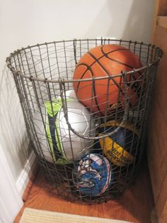
The first one was to get a basket and fill it with various outdoor equipment and put it near the elevators.  I originally thought this would be a nice nudge because it would give the person the idea of going outside while also some direction as to what to do without saying either. It was also a nice bonus by encouraging people to get moving too.

14413

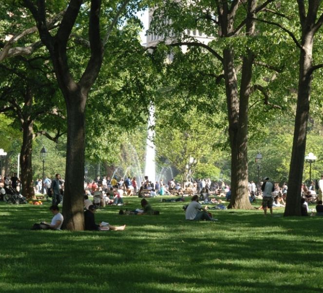
The second was to post a live feed of Washington Square Park to show what was currently going on outside. Unfortunately, there seems to be no live feed of Washington Square Park.  There are a few live feeds of other parks around New York but it felt too distant and almost confusing.

I then realized maybe I could use the “stick” method instead of the “carrot” to do this by posting pictures of the people bundled up in winter outfits and add a reminder that winter is coming.  This picture would show the reality of what we are going to face fairly soon and not the glorified one that shows it only after the first snow.

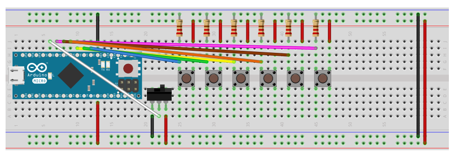
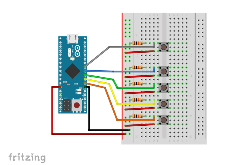
However, I ran into a few issues with all of these. As I was about to hit buy on Amazon for balls and other outdoor equipments, I started to think about the best days to do this.  Since it is at the beginning of the semester most people would be on the floor on Wednesdays, Thursdays, and Fridays.  This was great since it was after class but it is also the same time as the help sessions and other club meetings. After talking to a few people, I started to realize that people are just on the floor to get their work done and then go away especially on these days.

In addition, the idea of the images felt more like a push than nudge since they were pretty much telling the person to go outside.  Also, for people that haven’t been here during the winter might not understand how miserable it can get.

Ultimately, the deciding factor was quantification.  How can I quantify if people are going outside once they leave the floor? Cameras would only catch them leaving but not where they end up.  They could have taken the balls but that could have just been to take them.  It felt like there was no way to fully quantify the success of this experiment.


Contacts

Because of this, I decided to switch to a more personal nudge experiment: removing eye contacts.
main-qimg-18787865ded611a3afce3f49ae0b3675-c

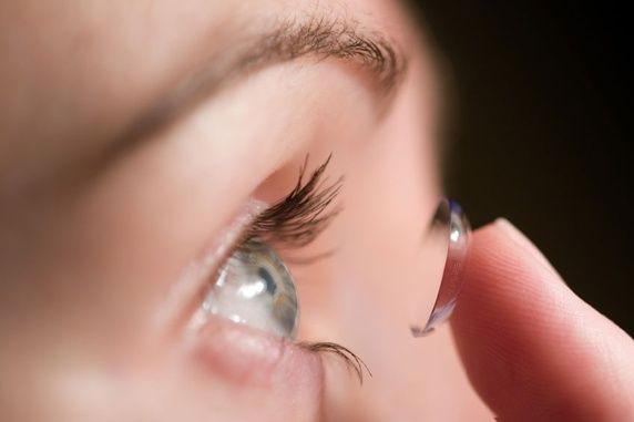
I have to confess that I am not the best at taking out my contacts each night. I don’t go forever without taking them out but it will be a few days.  My nightly regime was usually done before I fully finished homework or reading so I usually needed my contacts and preferred contacts over glasses.  These are the retrospective reasons I have determined for not keeping consistent.  However, I know I need to do this.  It’s something can be dangerous and cause diseases.  I decided that this was something I needed to try to do for my personal well-being.

Most importantly, this was something I can easily quantify since I would be the subject of the experiment.  At first I thought this could get in the way since I would be aware and could be biased to my actions (i.e. taking them out since I was aware) but I think because of how busy and/or groggy I get at night, it would counteract the full awareness of the experiment.

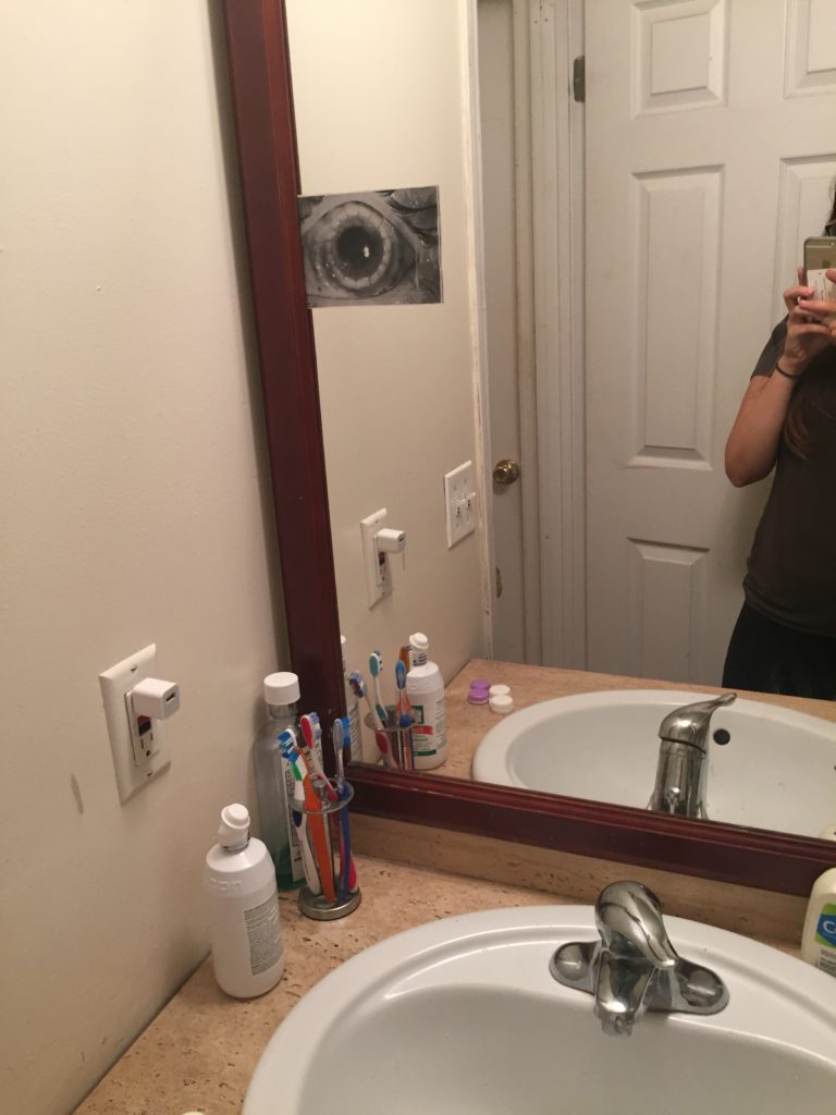
I decided I could do this by putting up a picture of diseased eyes. It helped with things like cigarettes so why not contacts. I originally thought I would put it on my phone but I decided that wouldn’t be good for two reasons: 1. I didn’t want to flood myself with the image to the point that I couldn’t even wear contacts again. 2. I didn’t want others to see the gross picture and think I’m a weirdo.

Because of these, I decided that I would put up a picture in my bathroom.  This would keep the association to the bathroom and only when I was home.  In my research for a picture, I found an article about a young woman who did not take out her contacts for six months and microscopic bugs ate her eyes to the point she went blind.  The picture attached was beyond disgusting (Warning: Picture is Repulsive.)  While the DailyMail isn’t the most accurate in news, it was useful for this experiment.

I printed the picture in black and white because my roommate would not have been pleased with the colored version. For me, even when looking at the black and white, I could still see the sickening colors.

I put the picture up on Thursday night and started the experiment.  I left it up throughout the weekend.

img_4624


Results

I can say that I was surprised about how well this worked. Not only did I take them out, I also wouldn’t wear them when I didn’t need to.

On Thursday before putting up the picture, I was already disgusted to the point that I had to take my contacts out. After that, I was diligent about taking them out as soon as I got home.  Even when I spent the night at my boyfriends, I took them out before going to bed without the need for the picture.  Every night, has been a successful one.

I don’t think I would want to keep this picture up forever. Not only is it disgusting, but it also could lose some of it’s power after awhile.  However, I think that I could use this in the future if I stop being as diligent about taking them out.

Also, I plan to do something about the nudge of encouraging people to go outside as a personal project. It’s too nice outside to miss this opportunity.


Good Interaction vs. Bad Interaction: Door Edition

We use doors every day and the way they are designed is a huge effect on us.  At some point, we have grabbed a door handle and quickly jerked it towards us as we move forward only to be met with embarrassment and feeling like a slight idiot. However, I’m in the belief that no one should feel like an idiot when grabbing the door incorrectly other than the designer.  

When a door has a handle, especially a vertical one, it is the user’s instinct to grab it and pull.  A “push” sign can help but usually this is not read until after the user has incorrectly interacted with the door and confused as to why the door isn’t working.


On example of this is the entrance door at Museum of Chinese in America (MOCA).  It’s has long vertical handles on a glass door on the right side when entering and the left side when exiting.  This is actually a good example of a good interaction and a bad interaction.  When entering, the bronze handle is easy to see, allows people of different heights to grab the handle to pull the door towards them, and because the door is glass, it allows easy visibility to whether someone is coming out.

MOCA Door

However, on exiting, the same door is used but gives a different feeling. It has the same benefits about being long for different heights and easy to see.  This time instead of being able to pull, the user has to push.  The problem is the handle indicates a pulling motion.  The user wants to pull it and may just do that a couple times before realizing that they have to push.  It’s interesting how such a small interaction can evoke feelings of embarrassment and awkwardness.

In contrast, there are a few examples of a well designed doors.  One being a motion sensor door.  For a place like retail store, a motion sensor makes a lot of sense because it allows people easily to come in and carry out the items they may have bought.  It is especially nice for stores that have carts because the customer does not have to deal with opening the door and then dragging their cart out.

However, this is not necessarily the overall right solution. A general solution that can work is a hand plate with a sign that says “push” on one side and a handle with the a sign that says “pull” on the other.  

Another great solution is a horizontal push bar that requires the user to push on the bar which then pushes the door. This is a great solution for a door that needs to be securely closed.

Overall, I think by the awkwardness of a bad door interaction can be helped by remembering it’s not you, it’s the door.